Friday 3 August 2012

No Direction Home

Due to the success of the End of the Road festival (an annual music event which leans more towards the contemporary folk end of the spectrum) the organisers saw fit to create a new summer attraction in the shape of No Direction Home.

Musically, the festival takes cues from the folk and Americana revivalist scene, this small festival (set in the grounds of Welbeck Abbey, Nottinghamshire) attempts to bring a wealth of activities and music to a family orientated weekend.

No Direction Home Festival from End of the Road Films on Vimeo.

I was kindly selected by the organisers to design and screen-print a poster for the event and having already seen the lineup (including favourites of mine; The Low Anthem, Dirty Three and Lanterns on the Lake) I was more than happy to contribute a print which would be sold at the festival and online afterwards.

After a lot of false starts with the design, I settled on the above image which works as a collage of activities that will be taking place at the festival. The birds were mainly included as a reference to the festival's design aesthetic and also, birds are cool!

Here is an initial concept draft for the final poster and you can see the light grey circle, which I used as a template to keep all the elements in order.

Here are the 3 transparencies for the screen-print, which were printed off in small sections and then assembled using tape. This made the process feel much more hands on and organic.

Here is the first screen with the images burnt onto the mesh.

The pink / red paint is pulled over the mesh using a squeegee, pressing the ink through onto the paper below.

And here is the first colour on the paper.

Here are the posters with the first colour having been printed, drying on the racks.

The second screen is locked in place and the process is repeated.

This picture shows the blue paint, having been pulled across the screen.

A photo from underneath the screen.

In this picture, you can see two pieces of paper where the top left corner of the poster is. This is for registration purposes and ensures that every time I put the paper down on the screen-bed I know that when the second colour is 'pulled' it will line up perfectly with the first colour.

Onto the third and final screen. Here is a picture of the screen, locked in the bed.

The third colour has now been 'pulled' through the mesh and the paint is transferred onto the paper. And by the looks of things, it's looking good.

Here are the posters, drying on the racks waiting to be cropped and then signed and numbered.

Here is the final poster, which has been cropped to fit perfectly in a square frame from the Ikea 'Ribba' series. I considered this when designing the poster, that people would like something that they could frame cheaply and easily.

I hope thats given you an insight into how the poster was designed and printed. In addition to this process blog, I thought it would be insightful to include a small essay which was sent to me by a very talented freelance writer named Janine Redding, detailing the history of screen-printing.

Screen Printing: A Brief History

Whilst some members of the artistic community that are deeply involved with screen printing will be the first to swear that it is a “timeless” method of producing art/copies/what have you, there might equally be those that would be surprised to learn that – at least as far as the overall process of printing goes – screen-printing is a *relatively* young concept, having really only been popularised to a great extent in the last hundred years or so.

An interesting point to mention would be that screen printing as a whole has remained relatively faithful to the original/early technology that was employed since day one, chiefly the woven mesh/stencil tech. Naturally, certainly aspects have changed with time (a good example being the move from silk mesh to polyester), but screen printing has by and large remained delightfully free of the awkward need for the biggest monitors, fastest CPUs, the best broadband technology race that has so effected other areas of artistry (or indeed that has permeated life in general).

The First Appearance – Traversing the Globe

Technically, screen printing’s actual first appearance in the history books would have been way back around the time of China’s Song Dynasty (960-1279 AD), in which it was scant more than a variation on a stencilling technique. Of course, this method flourished all over Asia and improved as the centuries rolled by; however, it wasn’t until around five hundred years later that it found its way to Europe/the West via trade routes and travellers.

Yet even at this proverbially late stage in the game, screen printing was still yet to take off in Europe, largely due to the fact that the requisite silk mesh was hard to come by, due to the limited number of them available by trade. This would have in turn driven up the price of the aforementioned screens, so a more profitable use for the process needed to be found – or even just a barely profitable usage, seeing as how screen printing was a fairly novel technology at the time, with not many commercial uses (in Europe, at least) found for it yet.

Widespread Use

Fast-forward to the early 20th century, where photography, printers, and photo-reactive chemical processes were all the rage. A trio of developers (Charles Peter, Roy Beck, and Edward Owens) would be largely responsible for furthering the commercial use (or at least the idea that it could be used commercially) of screen printing, via their experimentation with various chemicals to produce photo-reactive stencils (a method/idea which would – even then – take some time to find acceptance amongst the community), albeit these chemicals would prove to be somewhat toxic and dangerous, a problem which has – fortunately – been resolved for a good while now.

The 1930s would see the founding of the National Serigraphic Society (“seri” from the Latin for “silk”, a reference to the mesh used in the process) and screen printing was a veritable force in motion for both artistic communities and with great industrial printing applications.

Recent History and Pop Culture

An early adopter of the screen-printing-as-art philosophy was American artist and pop-culture icon Andy Warhol, particularly the numerous images of a screen-printed Marilyn Monroe. This rise and subsequent popularity of the both the artist Warhol and the screen printing method he employed would see a boom befall the screen printing industry and one that would continue on apace and is still a viable avenue of artistry to this day.

Arguably, perhaps one of the chief reasons that screen printing was and has remained such a popular mode of art, is because the materials required for basic screen printing are relatively cheap and easily available these days. Thanks in part to this, screen printing has become iconic, with its “non-professional” guise and seeming simplicity and has seen it grace everything from posters, to album covers, to shirts, to everywhere. Its prevalence is such that the Printers’ National Environmental Assistance Center has stated that screen printing is perhaps the “most versatile of all printing processes”.

If past advancements and recent years/decades are any indication, then screen printing and the implications it may have (particularly as a medium for art) can only see further improvement and increased interest – no doubt culminating in many an intriguing work of art for many moons to come.

Tuesday 24 July 2012

Go Forth and Print

Due to popular demand following last year's workshop that Graham 'Army of Cats' Pilling and I ran, we returned to the West Yorkshire Print Workshop to conduct another course based on the screen-printed gig poster.

The course took place over two consecutive days at the WYPW in Mirfield and included details on how to best design for the screen-printing medium, tips on specific printing techniques and industry knowledge and experience about working in the screen-printing field.

The six patrons who attended got to print a poster (designed by Graham - as modelled by me above) on the first day and learn about the process. Day two involved the attendees printing their own designs which they brought and with mine and Graham's help, were able to develop into an appropriate print. This would then be printed across the day and the results available to take home.

I was able to document the first day of the course, which involved the teachings of the process and hands on practise for all those who attended.

Here is Graham, debriefing the students whilst discussing the science of effective paint mixing.

Showing the course how to print, manually using a squeegee.

Here are some photos of the group, printing the first colour of Graham's print.

The first colour is down and the group have done a great job.

Here are pictures of the group printing the second colour.

The prints are complete and drying on the rack.

Here Graham is illustrating to the class various techniques that can be applied in Photoshop in how to make a suitable file for the screen-print process.

Graham, the illuminating beacon of screen-printing knowledge!

And here is Graham, modelling his wonderfully designed print.

If you like the look of this course and fancy enrolling for a weekend of screen-printing with two industry professionals, then get in touch with WYPW [ info@wypw.org ] and demand us! Oh and there will be banter and hilarious anecdotes, guaranteed!

Monday 30 April 2012

Black Flies

Back in February I was approached by a man named Kevin King, who had a project called Secret 7, which was linked to the annual event of Record Store Day and Teenage Cancer Trust.

The project was to feature 700 unique 7" record sleeves, interpreted by 700 artist's with an aim to 'rekindle some of the excitement for vinyl sleeve art in the digital era'. These were then to be exhibited at the Idea Generation Gallery in London and sold with 100% of the profits given to the TCT charity.

From the list of tracks available I picked 'Black Flies' by Ben Howard, whose debut album 'Every Kingdom' gets played quite a bit in my office.

Since the purpose of this project was create a one-off artwork, I decided to take a different approach to the design process. I selected various elements from previous designs I had created, not knowing if they would work together as a single composition. I did of course, resize them all to fit on a 7" sleeve, so I wasn't going in totally blind.

I decided to create an environment for the design, using screen-printing and here are the transparencies for the print.

A layer of light sensitive emulsion is applied to the screen and then the images are transferred to the screen using UV light. Here are all four layers of the print on one screen.

Here is the first colour, having been pulled through the screen.

The print on the sleeve - as you can see I've used masking tape to create a white frame around the print.

A close-up, showing that the sky is made up of halftone dots.

Printing the second colour.

A pink sun...

The third colour down, orange bricks.

Using the same orange, I printed the titles on the reverse of the sleeve.

Now here comes the tricky part. I wanted to create a 3D layered artwork, so I cut out a window frame shape from a piece of mount board. I then used my trusty Pentel pocket brush to illustrate a wood effect for the frame.
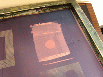
I then painted the window frame using a selection of acrylics, and never applying the paint too thick, so as to allow the illustrated wood effect to show through. I also printed a few flies onto acetate, which were affixed to the frame.

Here is a picture of the screen-printed sleeve, awaiting the frame to be put in place.

Here is the final cover, with the frame attached to the sleeve using double-sided tape.

A close up of the finished sleeve.

All in all, this was a fun project to work on; going into production of a final piece and not really knowing how it would turn out was a pretty daunting experience but I'm really happy with the results.

It was also fun to combine my love of screen-printing with a different, crafty approach. Hopefully the owner of the sleeve is enjoying it as much as I did putting it together.

You can buy the remaining sleeves from Teenage Cancer Trust's eBay page.

Thursday 26 April 2012

Ink & Paper

May is looking like a busy month for the UK poster community with three exhibitions taking place across consecutive weekends.

The first of which being Poster Roast as part of Camden Crawl.

With a bit of a twist this year, Poster Roast will be host alongside Alternative Press and Lexington Record Fair, making it quite a DIY day out in the heart of Camden.

It's all free to get in and more information on the three day event can be found here and it promises to be an exciting venture.

The following week comes the debut UK poster show by the UKPA, which will feature both UK and US artists, again taking place in London.

This event will act as more of a gallery show than an expo, with posters having their own space and will be available to purchase at the event.

There will also be a series of discussions, debates and a Q&A on the Sunday from 4pm featuring ramblings from a bunch of talented friends including Graham 'Army of Cats' Pilling, Drew Millward, John Howard and Lil Tuffy. There are plans in place for these talks to be filmed, to further spread the knowledge of these illustration disciples.

The following week will see the return of Screenadelica as part of the huge annual event, Liverpool Sound City.

LSC is an international music, media and technology conference and live arts and music festival, which started life in SXSW a few years back.

This will be my first year exhibiting my wares at Screenadelica and I hope to make it over there for the Saturday. More information on this year's event can be found on their website.

Monday 23 April 2012

Scottish Winds

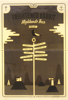
I was recently asked by Frightened Rabbit to design a tour poster for their Highlands Tour, in which they played intimate venues in small Scottish towns.

I love the thought of a band on a major label making such an effort to play to their fans who might not be able to get to their shows, which often take place in the major cities of Scotland.

People who know me will know that I'm quite fond of FR; I consider their second album 'The Midnight Organ Fight' to be a genuine modern classic. So when it came to inspiration, I had a lot of ideas at the ready.

Firstly I wanted to have references to their lyrics and themes tackled across their albums; the sea, isolation, faith and lack thereof and combine it with the idea of the band heading up into the unknown wilderness to play these shows.

Here is a quick printing process of the day I spent screen-printing them.

Firstly, the screens are coated with a chemical called Azocol.

Here are the transparencies, which will make up the two layers / colours of the poster.

They are transferred to the screens, using UV light.

The screen is then clamped into the bed place and the first colour has been pulled through with a squeegee.

Hanging out on the drying racks.

The second screen in place, with the imminent brown to complete the print.

Here is the final cropped version of the poster, which I think came out pretty well.

I printed 130 in total, 100 for the band and 30 for me. They're now available in my online shop and if you want one, then get to it, as I understand they were pretty popular on the tour. Also, for one week only I'm offering free p&p within the UK.

Big thanks to the band and their management for letting me do these and also to Alice Munks, who helped get the ball rolling with the band about 18 months ago...